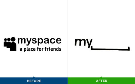
It seems that corporations have decided it’s a good week to release logo redesigns. After the Gap logo fail, myspace shows a new logo at a conference.
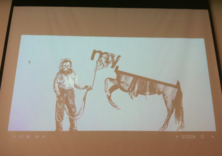
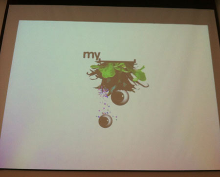
The logo is good and I love the concept behind it, but I wonder what it’s worth in terms of branding. It just doesn’t feel right not to see part of the name. On the other hand, it opens a whole world of adaptations for the logo (see images below).
I really can not decide whether this is a good logo or not, so I’m curious to know your thoughts about it. Anyone?


